
Showing posts with label english. Show all posts
Showing posts with label english. Show all posts
Tabletop Studio Photography done with mirrors
A creative save cost way for studio photography using just one light bulb and some mirrors.
Picture Control Setting For Nikon D90 /D300 / D3
Did some research from internet and found out some nice setting for our picture control which might increase the quality of images.
1)
Standard (saturation +1, sharpness +2, contrast +1)
- general use
Portrait (saturation +1, sharpness +2, contrast +1)
- love the flesh tones
Vivid (Sharpness +2, contrast +1)
- great for flora
2) This one i copied from one of the web
For Things
I set the sharpening to 5.
For photos of things, I usually start at VIVID and crank the saturation all the way up to +3. This gives me the psychedelic look I love.
For Accurate Product Colors in the Studio
I use STANDARD.
I prefer sharpenng set to 5.
I honestly have no idea if Nikon's ADR can work with studio strobes, so I turn it off and set contrast down to -1.
For People
For photos of people, I use NEUTRAL and set the saturation to +1. I prefer sharpenng set to 5.
STANDARD is less wild then VIVID, and NEUTRAL has even lower contrast.
You may prefer STANDARD and +1 or +2 Saturation.
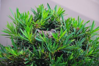
The example below is the different between (Normal Vivid + Sharpening = 7) and "For Thing" Setting which shown above.
1)(Normal Vivid + Sharpening = 7) (* i think its quite similar to standard setting)

2)sharpening= 5; VIVID with saturation +3 (For Thing setting)

1)
Standard (saturation +1, sharpness +2, contrast +1)
- general use
Portrait (saturation +1, sharpness +2, contrast +1)
- love the flesh tones
Vivid (Sharpness +2, contrast +1)
- great for flora
2) This one i copied from one of the web
For Things
I set the sharpening to 5.
For photos of things, I usually start at VIVID and crank the saturation all the way up to +3. This gives me the psychedelic look I love.
For Accurate Product Colors in the Studio
I use STANDARD.
I prefer sharpenng set to 5.
I honestly have no idea if Nikon's ADR can work with studio strobes, so I turn it off and set contrast down to -1.
For People
For photos of people, I use NEUTRAL and set the saturation to +1. I prefer sharpenng set to 5.
STANDARD is less wild then VIVID, and NEUTRAL has even lower contrast.
You may prefer STANDARD and +1 or +2 Saturation.
The example below is the different between (Normal Vivid + Sharpening = 7) and "For Thing" Setting which shown above.
1)(Normal Vivid + Sharpening = 7) (* i think its quite similar to standard setting)
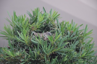
2)sharpening= 5; VIVID with saturation +3 (For Thing setting)
Subscribe to:
Posts (Atom)


